
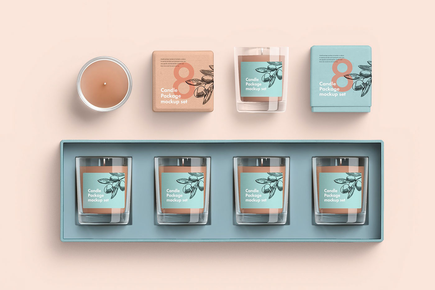
Choosing the right fonts and colors for your candle packaging is more than just a creative task. It’s a strategic decision that influences how people perceive your brand. Let’s explore how to make these choices wisely so your candles stand out beautifully on the shelves.
Understanding the Emotional Power of Colors
Colors have a powerful influence on how people feel. When customers look at your candle packaging, the colors can make them feel calm, excited, or even luxurious. This emotional response helps them decide whether to pick up your candle or leave it behind.
Soft colors like cream, blush, or sage green bring a sense of calm and relaxation. These colors work well if your candles focus on soothing scents like lavender or chamomile. On the other hand, bright colors like coral or turquoise bring energy and a playful feeling. They might be perfect for fruity or tropical candle fragrances.
Neutral colors such as white, beige, or gray can give your packaging a clean and sophisticated look. They are safe choices because they appeal to a broad audience. However, if you want your brand to be bold and memorable, deeper colors like navy, burgundy, or emerald green can create a sense of luxury.
Besides feelings, colors have cultural meanings. For example, in some places, red means luck, while in others, it means danger. It’s wise to research your target market and see what colors mean in their culture.
When you choose colors, think about how they look together. Too many colors can make your packaging look messy. A good rule is to pick two or three colors that match well and stick to them across all your designs.
Choosing Font Styles That Reflect Your Brand Personality
The fonts you choose tell a silent story about your brand. People look at the letters on your custom candle packaging and instantly get a sense of your style. Are you modern and clean, classic and elegant, or fun and playful?
Serif fonts, with little strokes at the end of letters, often look traditional and classy. They’re great if your candles are luxurious or romantic. Think about a beautiful wedding candle with elegant script. A serif font fits perfectly in this setting.
Sans-serif fonts are simple and modern. They’re clean, easy to read, and feel fresh. If your candles are trendy or minimalist, a sans-serif font might be the best choice.
Script fonts look handwritten and bring a personal touch. However, they can be hard to read if used too much. It’s usually best to keep script fonts for short words like your brand name rather than long paragraphs.
Another factor to consider is font weight. Bold fonts attract attention and give a feeling of strength. Light fonts feel delicate and soft, which may be perfect for romantic or calming candle scents.
Also, readability is crucial. A beautiful font is useless if customers can’t read it. Test your font choices on actual packaging mockups. Make sure words are clear even at small sizes.
Balancing Contrast Between Fonts and Colors
Good design means everything is easy to read. That’s why contrast is so important. If your candle packaging has dark text on a dark background, customers will struggle to read it. The same problem happens with light text on a light background.
High contrast makes text stand out. Dark navy letters on a soft cream background look crisp and elegant. White text on deep forest green gives a clean, modern feel. However, too much contrast can feel harsh, especially if you’re going for a soft, calming look.
Another point to remember is font weight. Thin fonts in light colors might fade into the background. If you’re using pale colors, pick bolder fonts to keep things legible.
Test your color and font choices in different lights. A design that looks beautiful on a computer screen might be hard to read under store lighting.
Contrast isn’t just for readability. It’s also a design tool to guide attention. You can highlight your brand name, fragrance, or special product features with bolder colors or fonts.
Here’s how you can create good contrast:
- Pair dark fonts with light backgrounds.
- Use bold fonts for small text in lighter colors.
- Avoid color combinations that vibrate or strain the eyes.
Balancing contrast well means your packaging looks clean, professional, and easy to read.
Creating a Cohesive Brand Story Through Design
When customers look at your candle packaging, they should feel like they’re getting to know your brand. Fonts and colors are key pieces in telling your story. A cohesive look makes your products instantly recognizable.
Imagine a brand focused on nature. Earthy colors, soft greens, and elegant serif fonts tell customers your candles are eco-friendly and pure. Meanwhile, a modern, youthful brand might choose bright colors and sans-serif fonts to show fun and energy.
Consistency builds trust. Customers recognize your packaging style even from far away. If every candle looks completely different, your brand loses its identity. You want customers to know that any candle from your range will have the same quality and vibe.
Your packaging also tells your brand values. A luxurious brand uses rich colors, gold accents, and sophisticated fonts. A handmade artisan brand might use soft colors and handwritten fonts to feel personal and warm.
Think about the feelings you want your customers to have. Calm, luxury, excitement, or comfort? Your design choices should match these feelings.
Considering Target Audience Preferences
Your candle packaging needs to appeal to the people you want to buy your products. Different groups like different styles, colors, and fonts. Knowing your audience helps you choose the right designs.
For example, young adults often love bold colors and clean, modern fonts. They might want candles that look stylish on social media. Older customers may prefer classic designs, soft colors, and traditional fonts.
Gender can play a role too. Men might be drawn to dark, earthy tones and minimal fonts. Women might prefer elegant scripts or softer colors. However, these are not rules, just trends to consider.
Think about why people buy your candles. Are they gifts? Home décor? Relaxation? Gift candles often need luxurious colors and elegant fonts. Relaxation candles might use calm colors and simple fonts.
Cultural background matters as well. Colors have different meanings in different cultures. Red might be joyful in one culture and aggressive in another. Research your audience carefully.
Ask yourself these questions:
- Who is my ideal customer?
- What feelings do I want to inspire?
- Where will my candles be sold — gift shops, boutiques, online stores?
Understanding your audience ensures your designs connect with them, making your candles more likely to sell.
Testing Designs Before Final Production
Before printing hundreds of packages, it’s wise to test your designs. What looks great on a screen might not work in real life. Testing helps you spot problems early.
Create printed samples of your packaging. Check the colors under different lights. A color might look perfect under daylight but too dark under store lighting. Make sure fonts remain clear and readable.
Ask people from your target audience for feedback. They might notice things you’ve missed. For example, a font might be too small for older customers. Or certain colors might feel too harsh for a soothing candle brand.
Testing can save money. It’s cheaper to change a design in the early stages than after you’ve printed all your packaging.
While testing, pay attention to:
- Color accuracy in print
- Readability of text sizes
- Contrast between text and background
- Overall brand feeling
Gathering feedback ensures your packaging is effective, attractive, and practical.
Sustainability and Eco-Friendly Design Choices
Today, many customers care about the environment. Sustainable packaging is not only good for the planet but also appeals to eco-conscious buyers. Colors and fonts can help you show your commitment to sustainability.
Natural colors like browns, greens, and beiges signal an eco-friendly vibe. Recycled papers often have a soft, earthy tone. These colors remind customers that your brand respects nature.
Fonts can help too. Simple, clean fonts without heavy ink coverage are better for the environment. Heavy ink usage means more chemicals and energy during printing.
Consider using eco-friendly printing methods. Soy-based inks are less harmful than petroleum-based inks. Matte finishes often feel more natural than glossy coatings and are usually more sustainable.
Customers love knowing that their products support the environment. If your candle packaging is eco-friendly, include a note about it. It could say “Printed on recycled paper” or “Eco-friendly inks used.” However, keep it subtle and stylish.
Practical Tips for Combining Fonts and Colors
Designing candle packaging involves blending fonts and colors so they look beautiful together. Here are some practical tips to help you succeed:
- Limit your palette to 2-3 main colors to keep things clean.
- Use contrasting colors for text and backgrounds for easy reading.
- Pair simple fonts with elegant colors for a classic look.
- Avoid using too many different fonts. Two is usually enough.
- Test designs under various lighting conditions to check visibility.
- Think about your target customers and what they love.
- Keep the brand voice consistent across all designs.
- Choose sustainable materials and finishes if possible.
Blending fonts and colors takes practice, but it’s worth the effort. Great packaging grabs attention and makes your candles unforgettable.
Conclusion
Selecting fonts and colors for your candle packaging is a creative journey with a practical goal. It shapes how customers feel about your brand and helps your products stand out. From choosing colors that spark emotion to picking fonts that match your brand’s voice, each detail matters. A thoughtful approach ensures your packaging is beautiful, clear, and memorable. Take time to test your designs and consider your audience’s preferences. When you blend style with strategy, your candle packaging becomes a powerful tool that turns shoppers into loyal customers.